FINDING OUR VISION
As the graphic design team at Plus 11, we recently took on the question of how to create an effective pitch deck. After a long process of researching, revising, refining and redesigning, we have to come to a solution that reflects the goals we started out with: make complex content digestible, emphasize our unique selling point, and appeal to logic over emotion.
“ART IS ABOUT MAKING QUESTIONS; DESIGN IS ABOUT MAKING SOLUTIONS.”
– John Maeda
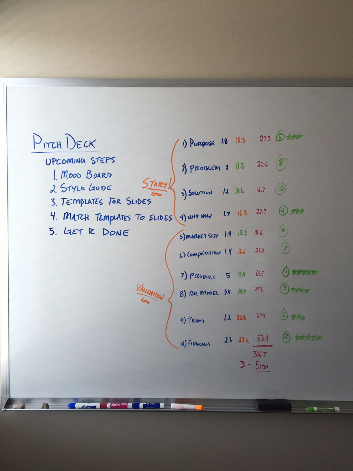
We started with a week of gathering research and inspiration, which led us in a very different direction from what we had initially expected. One of our most valuable resources was an article from TechCrunch, detailing the insightful results of a study of over 200 pitch decks. The study showed that VC’s spend an average of three to five minutes reviewing a pitch deck, and that the optimal number of slides is ten. This shifted our focus from trying to create an extremely detailed and text-heavy presentation, to a condensed and concise presentation designed to make an impactful first impression. The study also recommended slide content and slide order, based on the amount of time investors spent studying certain slides. We took this data and ran with it.

SETTING THE MOOD
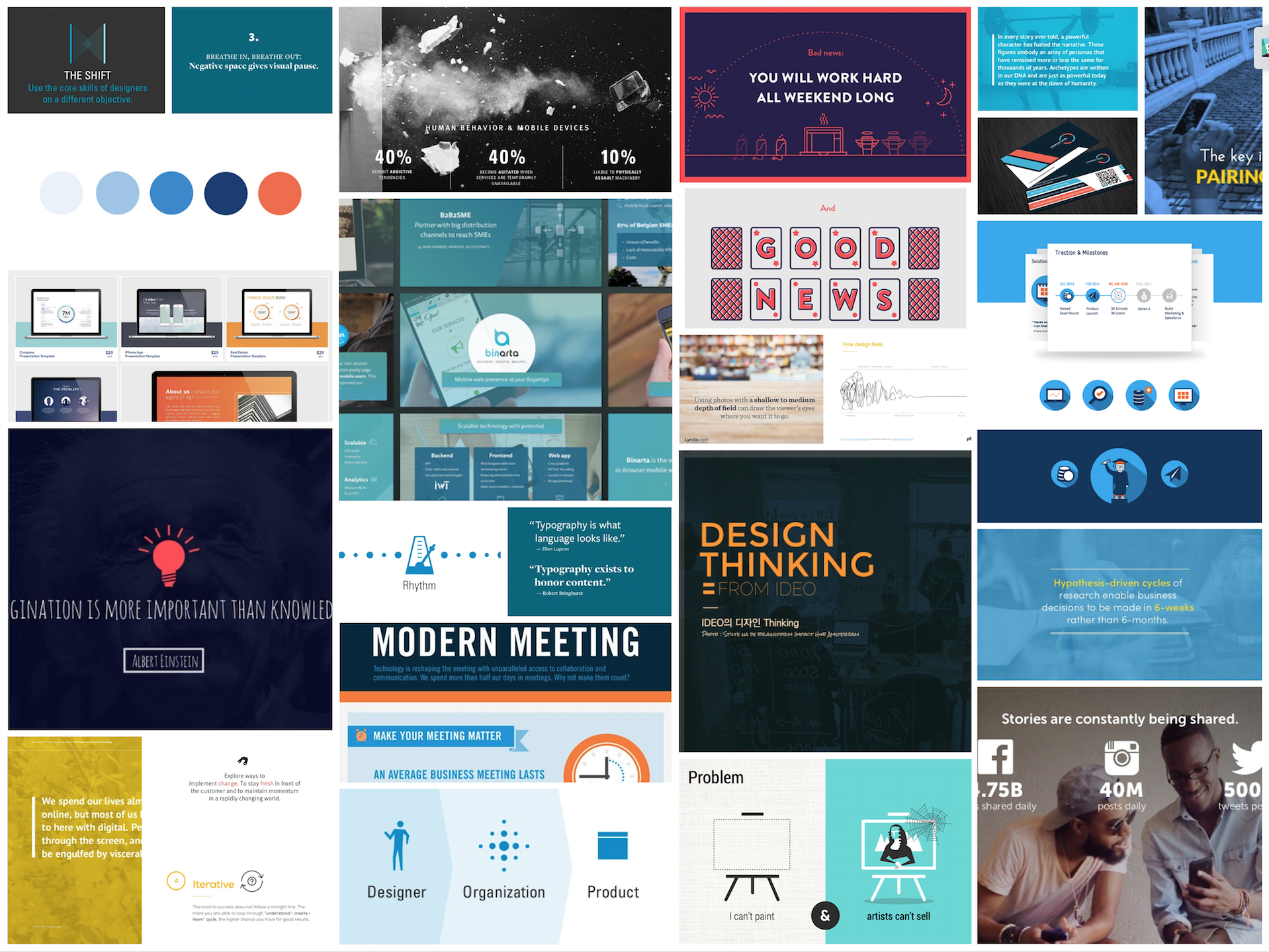
Because our first pitch deck consisted of thirty slides, we had to come up with a way to chisel it down significantly. We began looking for strong examples of visual storytelling and graphical representation of data, so that we could maintain the complexity of the content without it being overwhelming or cluttered. We created a mood board to bring together many examples of minimalistic, structured, and inviting design solutions, which would help us to achieve our goals. A lot of the design elements we incorporated into the style guide were variations of elements from this mood board.
CHICKEN OR EGG
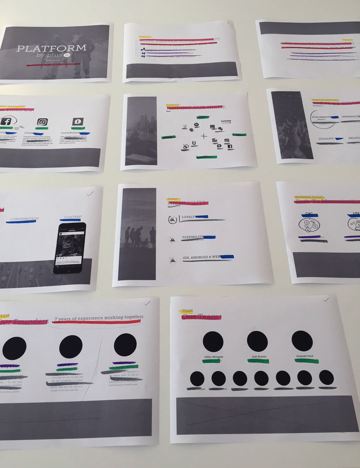
Looking back, we realize that designing the style guide should have come before writing the content. A style guide is meant to “guide” the whole process, so it would have been more effective for us to start there, but it was hard to create one without the other. We went through a slightly messy process of creating both the content and the style guide at the same time, which required us to make series of minor tweaks and changes that could have been avoided with a clearer direction. But as we worked through the content and found ways to articulate our information in a concise and simple way, we were led to some new design solutions along those same lines. It took time to get to a cohesive style and content, but the time and effort paid off.
“IF YOU CAN’T DESCRIBE WHAT YOUR PRODUCT DOES IN 7 WORDS, GO BACK TO THE DRAWING BOARD.”
This quote comes from a SlideBean article about the process of Airbnb’s pitch deck redesign, another resource that had a huge impact on the direction of our project. Airbnb presented a persuasive and concise description of their Purpose, Problem and Solution, which provided a framework for the rest of their content to fit into. So we went back to the most basic foundations of our product and redefined our Purpose, Problem and Solution. This is what we ended up with:
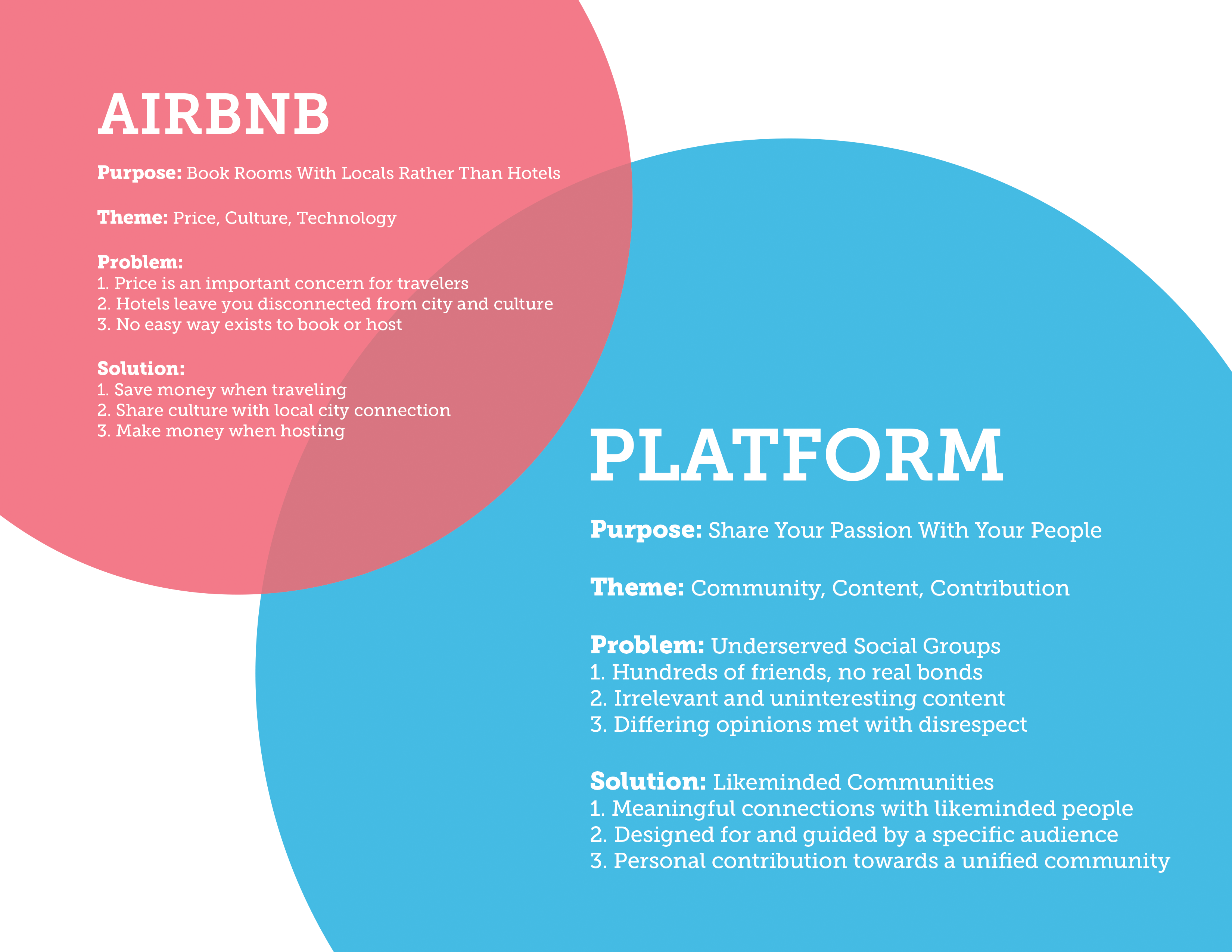
These points served as a theme throughout our pitch deck, and provided a way for us to present all of our information in a cohesive way. From this point on, we were committed to creating a concept-driven pitch deck, rather than a data-driven one. Concept-driven pitch decks are common for start-ups entering Seed round and Series A investments, while data-driven pitch decks are typically reserved for Series B investments. We curated the content and design to reinforce our main concept, “Share your passion with your people.”
CONCLUSION
“A DESIGNER CAN BRING A VIEWPOINT OF NOT JUST AESTHETICS, BUT ECONOMICS AND USAGE.”
– John Maeda
Our style guide helped us to further organize our content with guidelines for font style/size/color/position, composition, and use of imagery and other design elements such as underlines, outlines and bullet points. Dillon pointed out early on that “a team won’t function without opinions and collisions,” and we definitely had differing opinions about the visual style of our pitch deck. But he was right, the things we disagreed on sparked new discussions and ideas, and ultimately allowed us to fine-tune our work. What we’ve come to is far better than what we started with, and BONUS, we now have a more solid system for collaborating as a design team.