
How many times have you downloaded a new app, opened it up, and then promptly got so lost not even a search and rescue party would be able to save you? Questions abound; what do I do now? What does this mean? How do I do the thing? The design of the app may very well be appealing, but if you can’t figure it out within the first thirty seconds, the aesthetic sense ends up being moot.
If you’re anything like me, you’ll give up after a few minutes of struggling, leave the app, and then delete it a week or so later when you need the extra space on your phone to take more pictures of your cat.
This is not an uncommon experience; in fact, many app developers are running into the same issues with user retention. The average app loses about 77% of its DAU’s (daily active users) within the first three days after installation, and within the first month, 80% of those DAU’s are gone.
Such shockingly high numbers beg the following question:
What are successful apps doing that we can emulate in our app design and improve our retention rates?
The answer may surprise you.
It isn’t adding more features, changing the font, or even redesigning to look almost, but not quite like Facebook. No, dear reader, the answer is…
Nothing!
What are we doing with the “nothing” spaces in our apps? When a new user first signs up and sees a content-less white screen, how are we encouraging them to continue to experience the fruits of our labor? How can we incentivize them to contribute and resolve the empty screen? Are we holding their hand and supporting them so they feel able and willing to come back again and again?
This is where smart design kicks in. A smart designer understands the nature of the user and designs to improve the overall UX (user experience) of their app.
In the design world, the “nothing” spaces on websites or within apps or other programs are referred to as “empty states”. Well-designed empty spaces prevent any dead-ends within an app, re-engage users that stumble upon them, and add a splash of extra personality to an otherwise emotionless screen.
When a user stumbles upon an empty state, three things should happen as a result of the design:
- The empty state should EDUCATE the user about functionality.
- The screen should PROMPT the user to take the next step.
- It should DELIGHT and surprise the user with a clever, creative, and appealing design.
Educating The User
So many times, I have quit using an app almost immediately because it was too complicated or wasn’t explained in a way that was simple enough for me to figure out in the first five minutes or so. Using an empty space as a method of education of the functionality of the app can help improve user retention significantly. A smart designer will ask themselves three questions: what, why, and how.
- What is this screen for?
- Why am I seeing it?
- How can I resolve the problem? (More on this later)
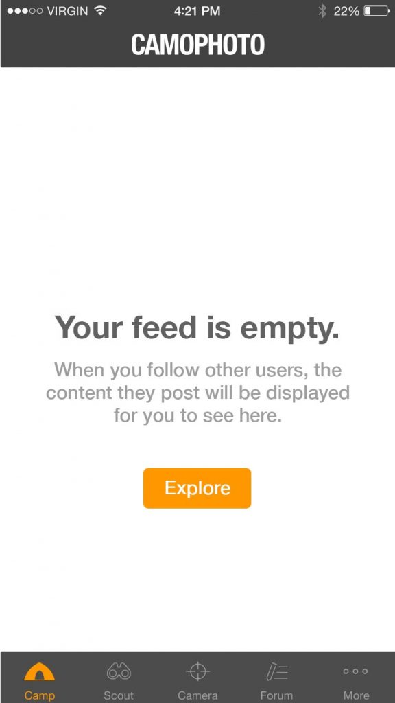
For this part, focus on the WHAT and the WHY. Make sure the user knows what content will be on the screen once they fill it. Let them know that the reason it is empty is because they are required to take some action to fill it. By keeping these questions in mind, you can encourage further usage of the app by helping the user feel smart enough to actually understand it.
This empty space is doing a great job of telling the user the “What” and the “Why.”
Prompting The User
Anyone who works in marketing can tell you that a call to action is a critical part of any advertisement – here is the product, now go do “X” thing (usually, buy it). So far, you’ve told the user WHAT and WHY they are seeing the empty state in the educating section. Now, you’ve got to tell them HOW they can resolve the problem, AKA, fill the space. In this phase, you want to motivate, persuade, and direct the user in a positive, friendly way. Use optimistic language with positive connotations to remind the user about the features of the app. Then, suggest a way for the user to get started. The call to action helps keep the user going by setting an expectation and then providing a way for them to fulfill it.
Here, the button acts as a call to action by telling the user what to do next or answering the “How.”
Delighting The User
We spend so much time and effort designing apps that look pleasing when they are filled with content but don’t put any consideration into how we can further press our brand image and stand out from a sea of competitors. A good empty space will be functional and informative, but a great empty space will incorporate clever imagery or another medium to reinforce the brand, set itself apart, and bring a relatable, “human” aspect to the screen. Using inclusive language that users can identify as human helps increase retention — when an app feels less like a robot and more like people, it delights, surprises, and invites the user to stay.
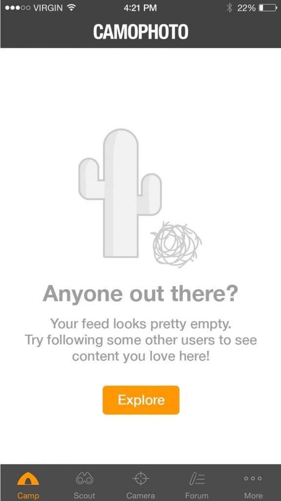
On this screen, the message goes above and beyond by making the WHAT, WHY, and HOW more human and relatable, and surprising the user with exciting, friendly imagery.
So there you have it! By taking extra steps to educate, prompt, and delight your users, you can improve your retention rates, reinforce your brand for memorability, and make your app that much more of a joy to use. Take my advice, and never take the “nothing” for granted again — because the way you use the “nothing” can really make all the difference!