My personal philosophy in “bettering” myself as a Creative Director, Designer, or Professional, is to always be learning. There is SO much to be learned out there and available to us for free. This comes in many different shapes and sizes, but one medium that I find easiest to peruse is articles. On a daily basis, I find myself reading an applicable article found on one of the many websites I have bookmarked on my phone or computer.
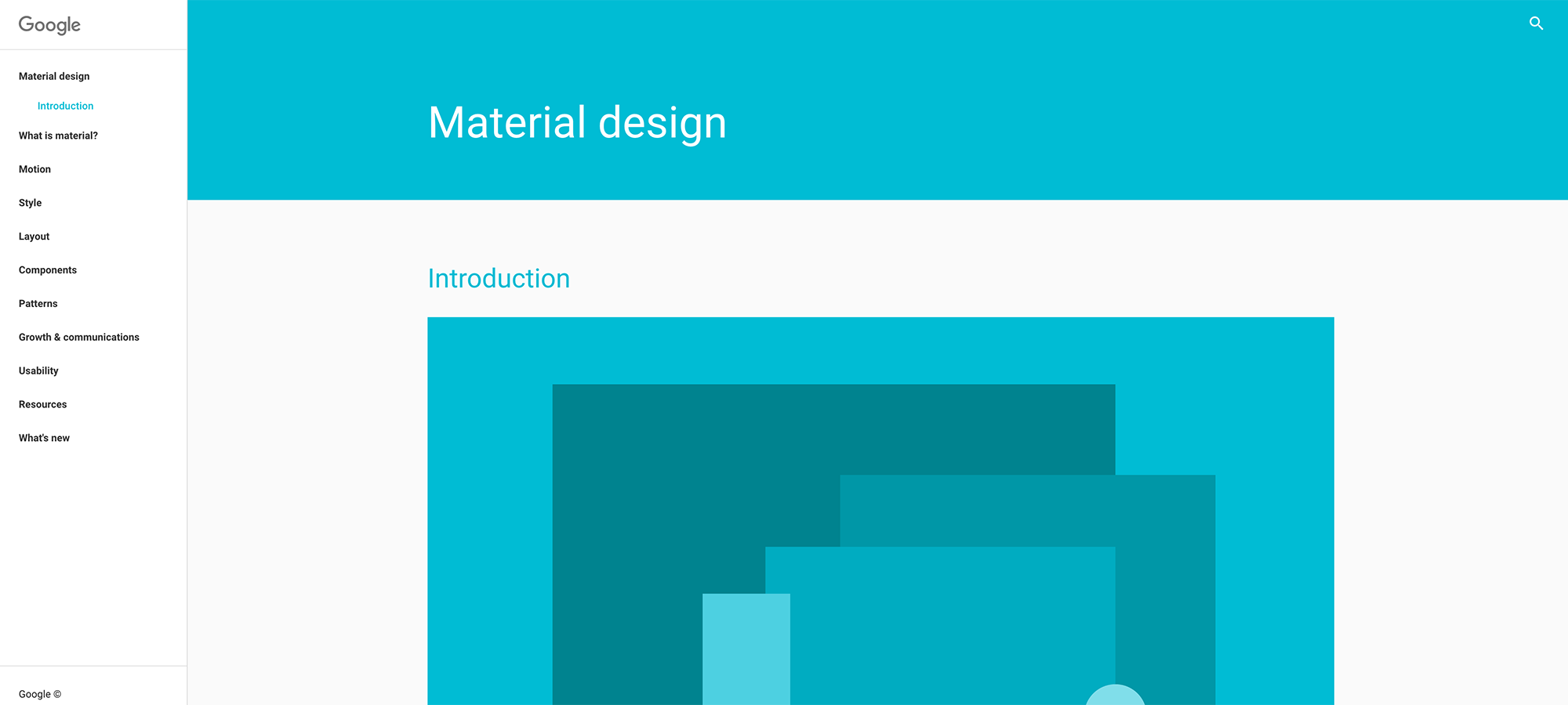
Recently, Google held their “Google I/O” convention bringing together developers exploring the future of mobile technology. Not something I would normally find myself too interested in, until I came across a presentation given here called “Learning To Speak Design.”
Designers and Developers are different. Can we agree to that? We’ve been taught on an academic level to think differently. As we get further down this path, we dive further into our worlds of design or development, and isolate ourselves further from the other.
This presentation is fantastic for developers, coming from a designer. I really like how clearly the design process is laid out, without going too much into detail for the audience (developers).
Give it a listen:
My Personal Highlights:
- The Ideation process – Quantity not quality. The brainstorming process is not completed before “spec” is completed. Ideas develop and take different forms throughout the process.
- Wireframes and Whiteboards are important. These low-fidelity tools help keep a level of unspecificity, which is essential at this point in the process.
- Understanding the User – A User Needs Statement. A user needs statement looks something like this. “Dillon is a Creative Director who needs (a way to) adequately present any given UI spec, because (person values) minimizing wasted time during UI to development handoff.” This captures the Who, What, and Why insights.
- Grids. Often overlooked as a part of the design process, but primarily because it has become such a second nature step. Grids help give consistency, hierarchy, order, and economy. Working within a grid solves many potential problems in both a UI and UX perspective.
- The need for more white-space. This space isn’t a “waste.” Breathing room will often times help a user feel less claustrophobic, and enable them to digest content easier. The adage that “users don’t scroll” has proven to be false. Don’t fear to add white space.
- There is a difference between font-weight “Medium” & “Bold.” While it’s easy to pass this off and say “ya, but they’re close enough”, the reason is in helping both hierarchy and legibility. Our minds are ready to subconsciously process the difference. Picture these font-weights as tools in the toolbox, there are going to be projects in which both tools are needed.
- Motion and Animation should not be overlooked. This is where interaction design and visual design come together. If you’re a developer and your work matches the spec, great… but we’re not done. The motion and animation between your two great spec matches will help the user follow along in the path we are leading them down. The motion should be thoughtful and not be distracting.
If you gave the video a listen they do talk specifically about Material Design and Android Development. The takeaways above, however, don’t apply to one single platform. If you are an iOS developer or web developer, look deeply into the principles talk in this presentation and find how they are applicable in your process.