You know those times when you catch yourself yelling at your phone or consider tossing it at the nearest wall? Maybe it’s because you’ve been staring at an endless loading icon for 10 seconds too long. Maybe it’s because you can’t figure out how to do something that seems like it should be intuitive. Or maybe it’s because of a not-so-commonly known theory called Resistentialism: the humorous theory that inanimate objects display malice toward humans.
Sometimes the only explanation for our frustration is that our digital devices hate us and want to ruin our lives. These problems can and should be solved by considering User Experience throughout every stage of the design process of an app.
Defined
User Experience refers to how a person feels about using a system. The goal is to provide the user with an overall positive and satisfying experience by incorporating elements such as simplicity, elegance, ease of use, consistency, function, and flow. There are many different approaches to achieving a high-quality User Experience, but industry leaders are currently focusing on two sets of guidelines known as flat design and material design. Both of these styles express a minimalist aesthetic in different ways.
Flat design is focused on reducing visual noise and consists of simple shapes and colors without stylistic elements such as textures, drop shadows or gradients. It is based on digital usability and rejects the idea of skeuomorphism or the use of design elements meant to imitate the physical world. Reducing the interface to the most basic elements of design emphasizes raw functionality over aesthetics.
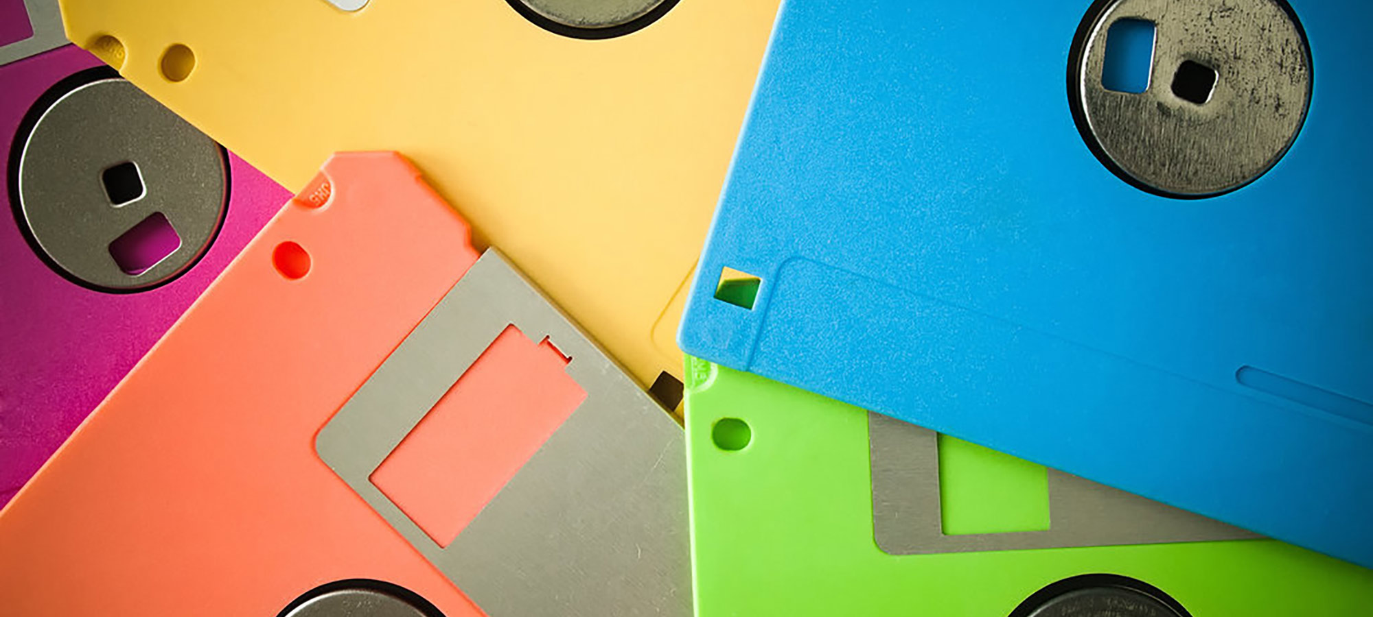
Material design is focused on making the User Experience intuitive and incorporates subtle skeuomorphic elements including textures, drop shadows, gradients, and other digital elements that resemble physical objects or materials. These visual cues prompt the user to complete certain actions and can make functionality more obvious because we are already familiar with similarities in real life. I was surprised when I became aware of how many digital applications are typically represented by their physical counterparts, like a paper envelope for email, a garbage can for trash, a floppy disk for saving, an old fashioned telephone for calls, and a set of metal gears for device settings.
Conclusion
It seems that the further away we move from these physical tools, the less use we will have for skeuomorphic representations within our digital tools. Users in the youngest generation may not even have a point of reference for many of these objects, like the floppy disk and the old fashioned telephone.
As technology continues to advance and evolve, design elements and styles will also need to evolve in order to provide the best possible experience for users.